Evolution of an organic OG
01 — Project scope
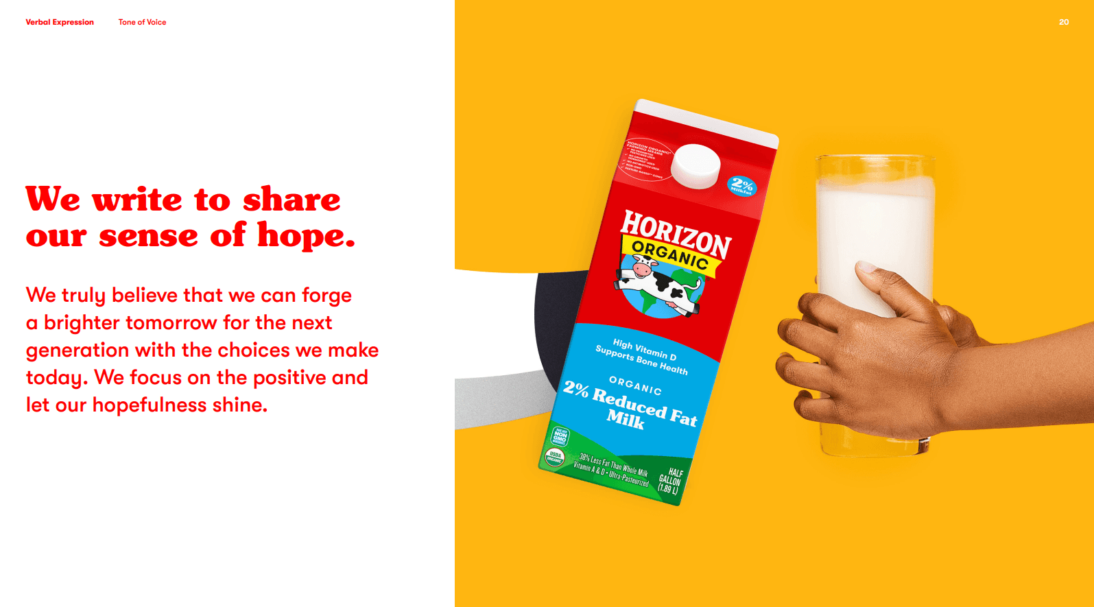
GROW UP & STAND OUT
Horizon Organic was the first organic milk brand sold nationwide, launching the category. As the category boomed, Horizon became just another carton on the shelf.
The team wanted to evolve the positioning and purpose of the brand to differentiate it as a modern premium leader, while still staying true to its roots.
Spoiler alert: We did it.
This portfolio-wide, multi-year project included developing and executing a new verbal and visual approach, deeply rooted in brand, consumer and category insights.
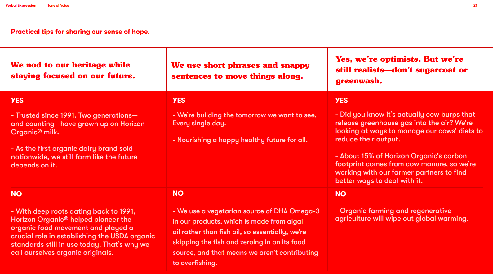
To help us get there, I created TOV guidelines and led copy development, whipping up concept statements, strategy ideas, testing copy, and all the pack and touchpoint copy (plus the inevitable ton of revisions).
02 — So much research
THE 30,000 FOOT VIEW
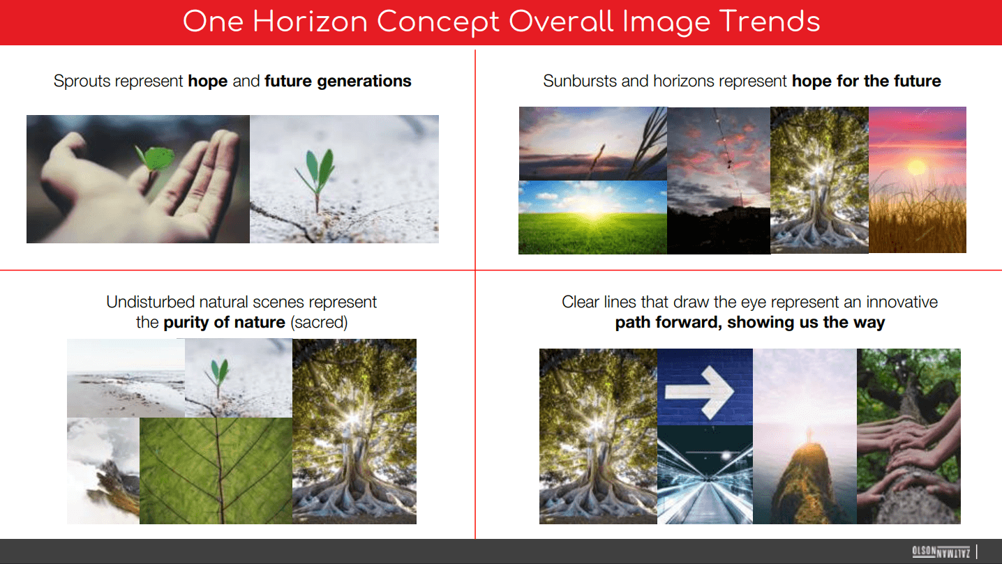
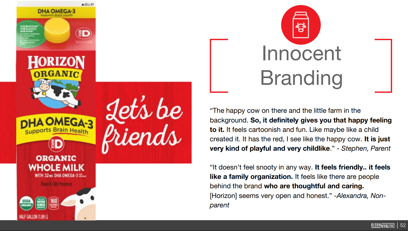
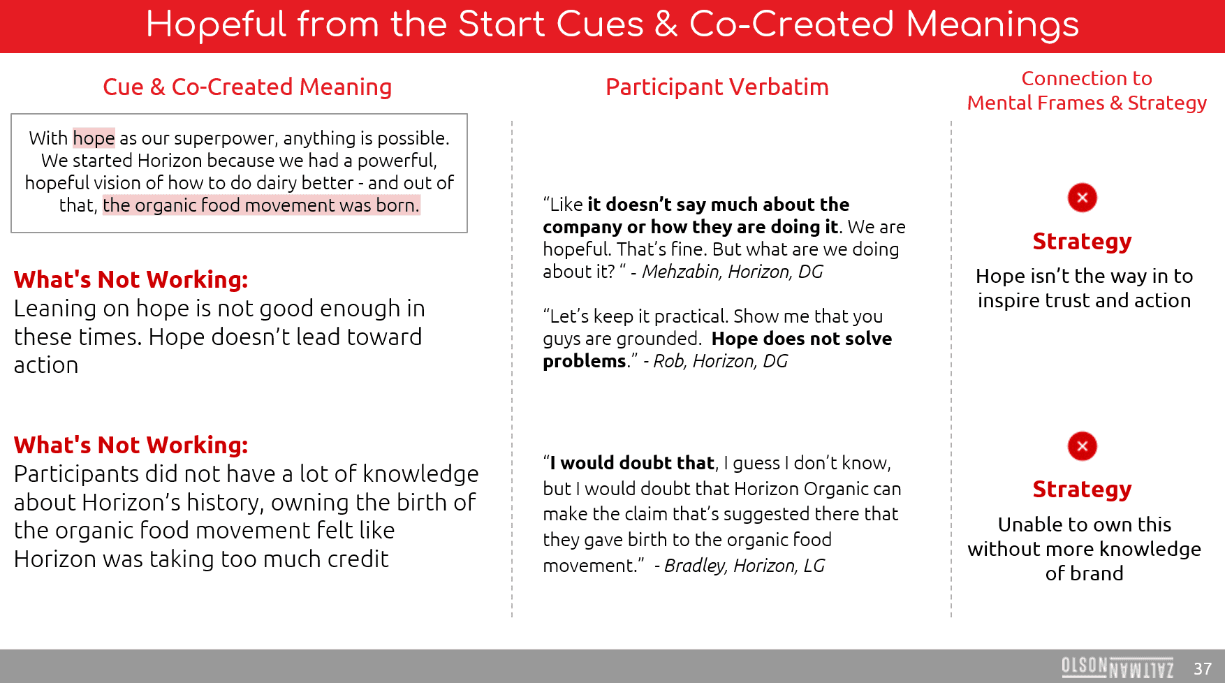
To chart the path ahead, you've got to back waaay up and see where you've been. We researched consumer perceptions of the brand to help us identify what equities were working. We dove into deep memory structures and archetype exploration with Olson Zaltman. We dug into semiotics for the category and analyzed the competition.
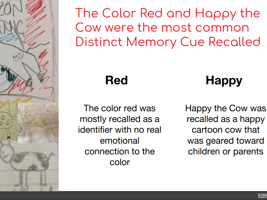
Consumers drew cartons from memory
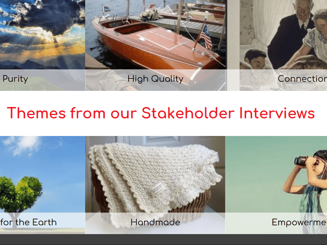
Our creative and brand teams got interviewed too
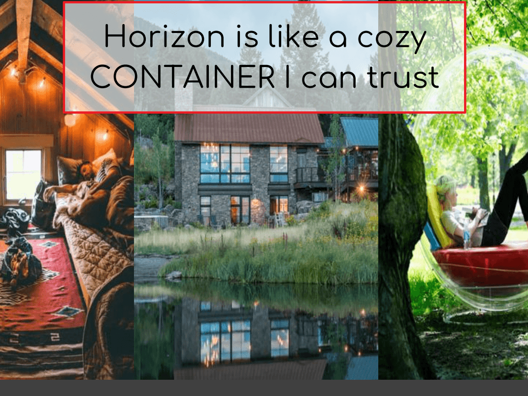
The predominant feels: safe, sound, and cared for
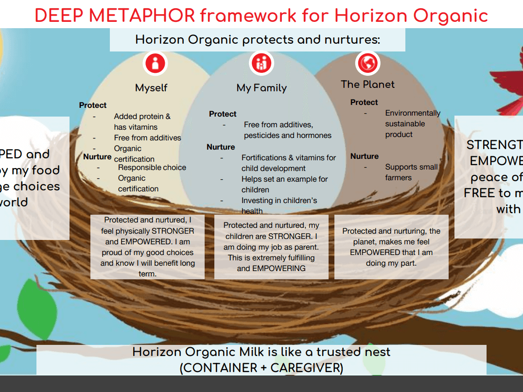
Olson Zaltman's research heavily informed our choices
03 — So much creative collaboration
UP CLOSE & CONCEPT-Y
One of the best parts of this project was the opportunity to collaborate. My design teammates were amazing, and we worked hard to unite the visual and the verbal. Inspired by research, we pulled swipe, we brainstormed, and we made up territories that morphed into concepts. Then we tested, learned, refined, and repeated.
Other close collaborators included brand partners, our brand strategy team, our insights team, our digital team, and our legal team. We also worked alongside some inspiring external agencies.
It's worth calling out that Horizon consumers acted as collaborators too, with several rounds of consumer focus groups, as well as store intercepts. (Who doesn't love sneaking up on people at the dairy door?)

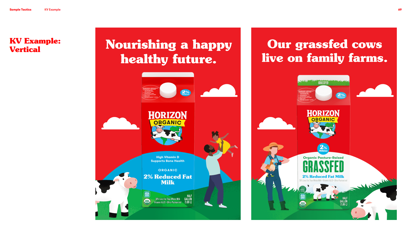
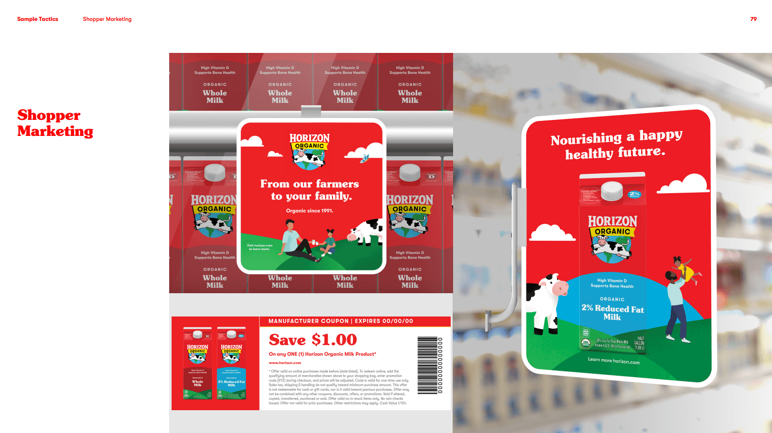
Here's one of the (many) concepts developed for testing.
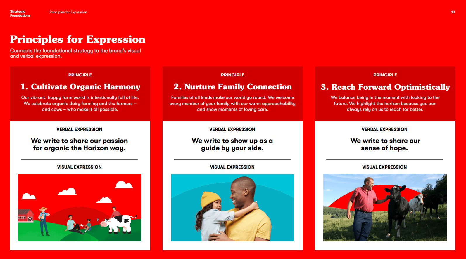
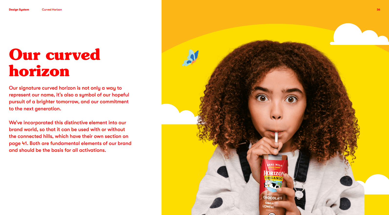
The curved horizon element and emphasis on hopefulness morphed their way into the final design and tone of voice.

04 — Look at us now
COHESIVE & COHERENT
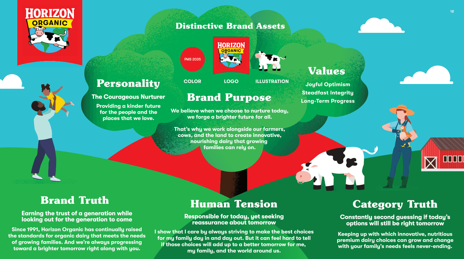
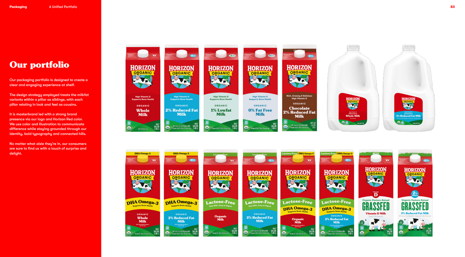
Long story short: success. We created a unique, unified verbal and visual system that elevates Horizon's purpose, celebrates its history, simplifies product navigation, and adds emotional depth.
I worked with design to create a foundational brand book to ensure everyone telling the Horizon Organic story is literally on the same page.
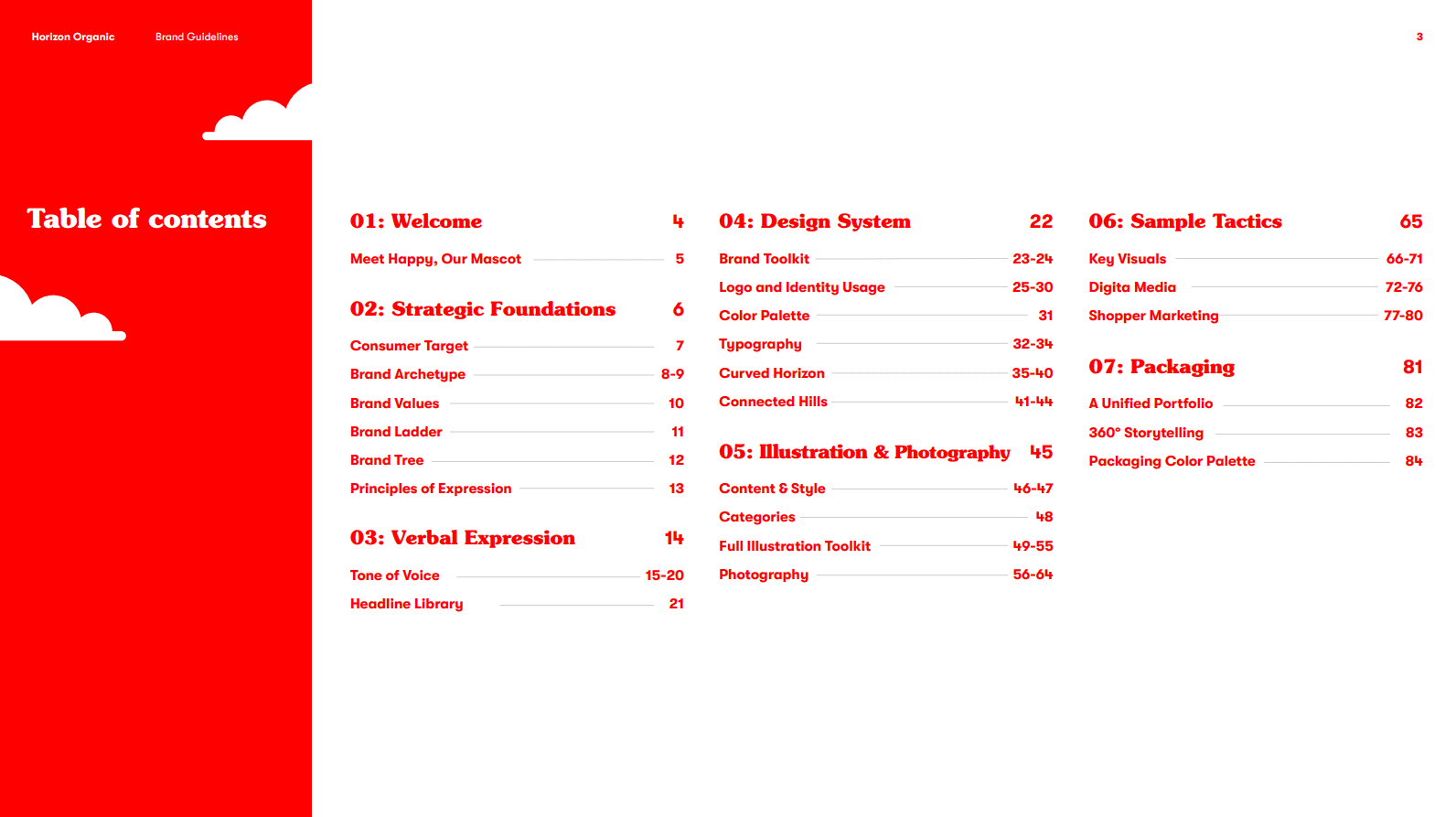

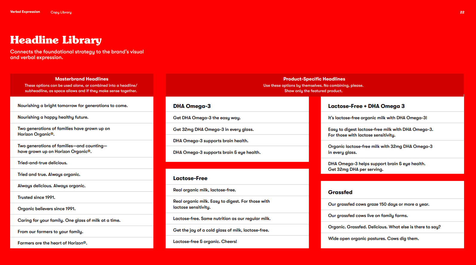
The brand book includes a range of approved headlines.
Along with design guidance that brings everything together, from screen to shelf.
05 — But wait, there's more
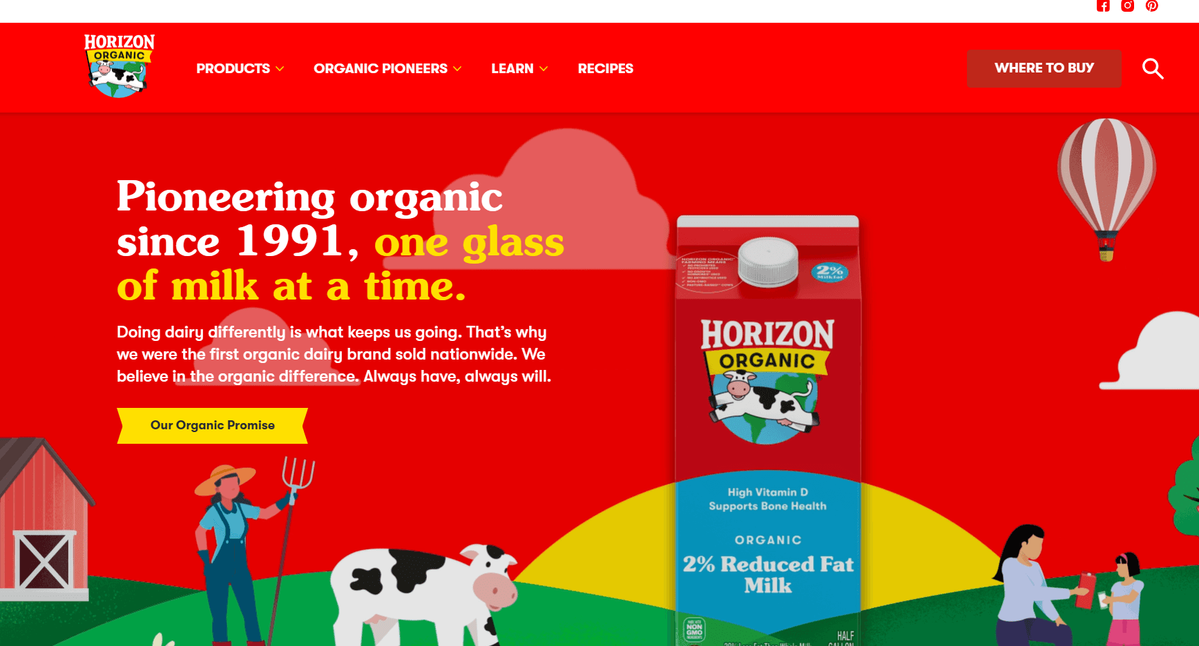
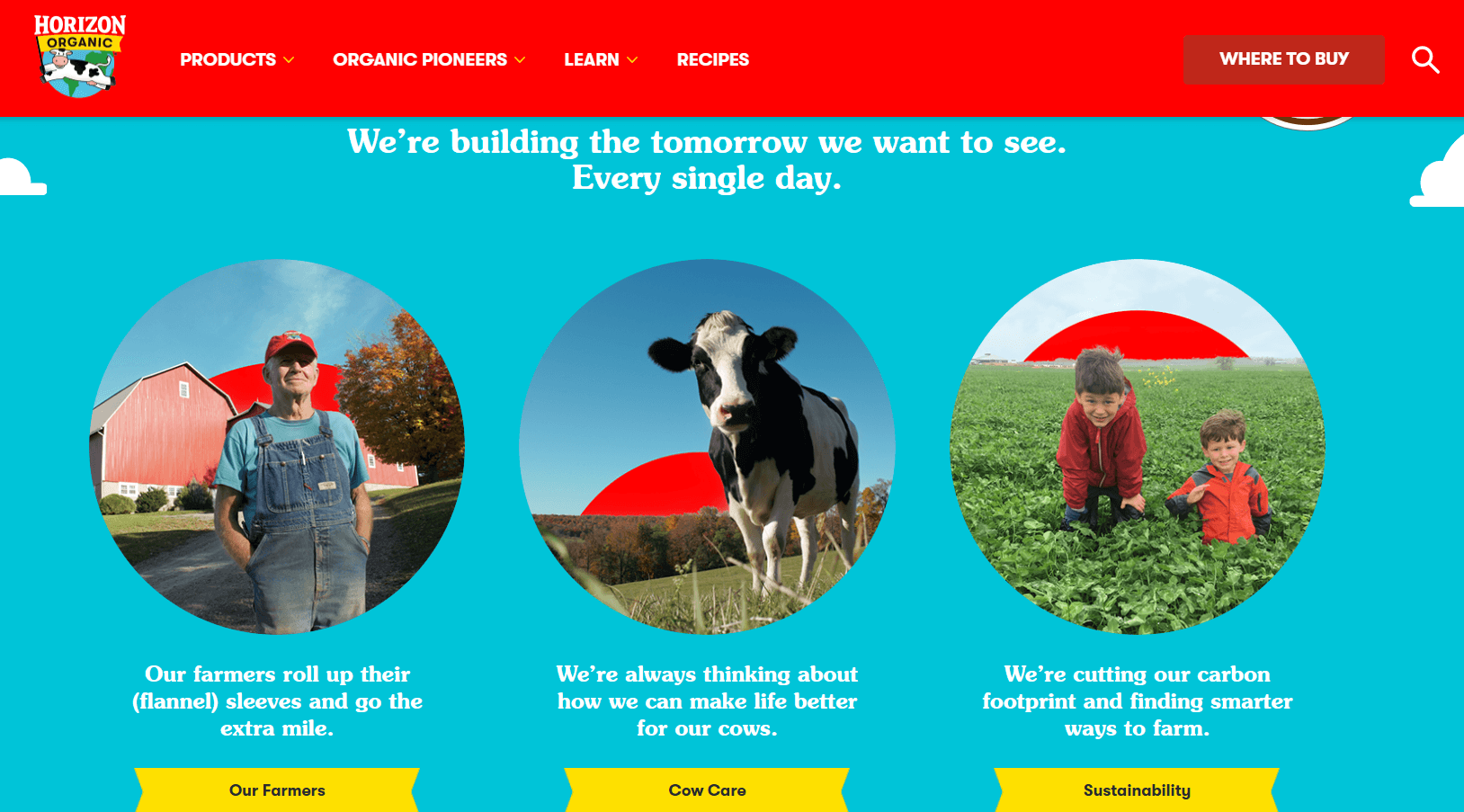
ELEVATING UX AND SEO
A key part of this project was a complete website overhaul, starting with an intensive audit. Together with the digital team, I worked on the new site beginning at the wireframe stage, all the way through writing the dev doc, incorporating SEO, and securing final approvals. Beyond telling the brand story, the website now delivers a much friendlier, more streamlined user experience.